Sales of mobile devices soar as sales of laptops level off. This is important news if you have a business website.
Every so often an article appears in the business news pages about the decline of the PC (personal computer). This might seem odd given that IT is a growing industry, but it is actually true.
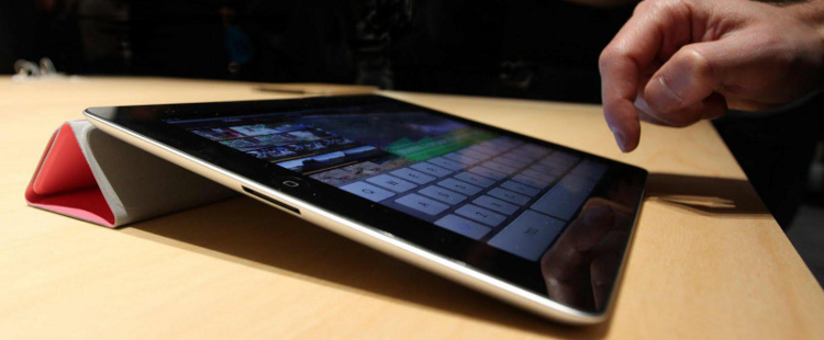
Once upon a time, if you wanted to read email, search the web or shop online, you needed a computer: a laptop or desktop. Now those same tasks can be accomplished with a tablet, iPad or smartphone. Many people are realising that there is no need to buy an expensive computer when lighter, cheaper more portable devices as just as effective.
So whilst computer sales wobble, sales of all devices soar.
If you have a business website, you need to pay attention to this trend. Then you need to check how your website appears when viewed on a smartphone or tablet.
If your website was designed a few years ago, it was probably designed on a desktop computer and reviewed and approved by you on a laptop. It might still look good on a laptop, but if it is difficult to use on smartphone or tablet, you need to think about upgrading.
Imagine yourself as someone searching for your services on a smartphone whilst on a train (and a lot of people do this). If they display your website and the text is unreadably small and a lot of scrolling and pinching is required, they are not going to stay on the website. They will move on to an easier to use website i.e. someone else’s.
If your website is not smartphone or tablet friendly, you need to think about Responsive Web Design (RWD). This is a method of laying out websites so that they resize and realign themselves to fit the screen they are being viewed on. The pages can then be read easily and navigated with the minimum effort.
If you take a look at your website on an iPhone and think “Oh dear”, then please get in touch. We will explain the options in straight forward language to help you get the most from your website.
We’re on 020 3129 6259